

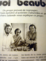
I have been converting magazine pages from scanning to text data. I have a 95% of success. I found that serif typos were converted very well than sans-serif. “Serif” is semi-structural details on the ends of some of the strokes that make up letters and symbols. I read some documents of the age when character was carved for lithography. “Serif can stand weathering more one century”. Now Exactly I feel it !
Japanese typo also has same detail. But I think it from brush shape or movement of calligraphy…
Now my assistant Asako is checking 5% error by human eyes…
例の雑誌をスキャナーにかけて文字情報に変換しています。95%完了。気づいたのは、セリフ書体の方が正確に変換できるという事です。セリフとは、活字の始点、終点に見られる飾りのようなもの。文字を石版に刻んでいた頃の話で「セリフがあることで、1世紀以上も風化を耐えることができる」という文献を読んだ事がありますが、今、まさに体感をしています!
明朝体などの日本語書体にも同じようなディティールがありますが、それらは、筆の形状や動きから発生しているので、ちょっと違うかな?
目下、ピヴォで働く現役女子大生のAさん(英文学部 修士論文執筆中)が残り5%のエラーを地味に修正中です。


2 Comments
Add Yoursお疲れさまです!知識を豊富にしてくれるブログで楽しんでいます!
you are really capable person who can produce a big essay!
I always wonder how you can make everything around you into something very interesting!!!! GREAT!!!
aikawaさん
先日はご馳走さまでした。また、コメントありがとうございます。
知識の偏りが問題です!
英語が書いてあったので、添削かと思い、汗をかきました。
副詞の使い方に気をつけています(笑)